When asking the group what the good things about our trailer they answered with the following; a wiode range of shots allowing for smooth transitions, Effective titles creating tension and enigma, Good use of location and costume. There were some negatives with our trailer mainly due to the pace and timing of our trailer, this was down tot he fact that because of the length of the trailer it made it seem more like a theatrical trailer rather than a teaser, this is perhaps not too much of a negative but does link to us giving away too much of our plot. The pace was judged as we held on too long on shots which perhaps detracted away some of the tension.
After receiving these comments I am pleased with the general themes that were involved in our trailer i.e acting, storyline, setting and camera work but perhaps some improvements were neccessary in the editing proccess with timings being the major problem.
Friday, 30 April 2010
Evaluation: Audience Response
Overall I am very please with the response we got from the audience when we did a question and answer activity and filmed it in class. Below are some of the comments we received...
Editing: Wide range of shots
Smooth transitions between shots
Titles: Attract attention
Makes the trailer more exciting
Begins to explain the narrative
What questions have been left unanswered? Don't no much about the characters and the cliffhanger at the end leaves you wondering what the main character has done wrong.
Mise en scene: Good use of locations
Good variation of settings
What could be done better? Wasn't a teaser trailer because it went on for too long, a different pace would have made it better.
The last comment is what is most important in our audience response because it is the one bit of criticism we received from it. We agree that this is one of weaknesses in our trailer, we believe we probably got slightly carried away with the shots and narrative and could of spent more time thinking up ways to shorten the trailer and possibly make the main character more mysterious and played with audiences thoughts and views on what was going on in the trailer. This is what we would do if we were to repeat this project but due to time restrictions we were too late to change it. Although we are happy we got more compliments and positive feedback on our trailer and are still happy with the content of our trailer rather than the time length of it.
Thursday, 29 April 2010
Saturday, 24 April 2010


Tuesday, 30 March 2010
Rubys Final Trailer Evaluation...
I think overall our group has produced a good quality teaser trailer that we should all be pleased with. Upon reflection I personally feel I have excelled the production I made last year which I'd guess is due to personal improvement and being part of a well working group. Compared to last year there are more varied camera techniques, smoother editing and generally more attention to detail as far as planning, titles, sound and mise en scene are concerned. I think it pays tribute to the good groupwork in our collective that our trailer shows influences and ideas from each individual. I think that group discussion was a strong point for us because we were able to consider a number of options for different decisions and narrow them down to the most effective choice. A difficulty we faced was time management, I think ultimately we overcame this and were able to meet deadlines but being one of the larger groups in our class it was sometimes difficult to find times outside of school where we were all free. I dont think this was overly detrimental to the final outcome but as with anything if we'd had more work time we might have increased quality. I think we used sound to good effect in our trailer; there was much discussion about when and when not to include non diegetic music and I think we managed to find a relevant soundtrack (inkeeping with copyright laws) and put it together well. The fact it starts softly and builds in time for our action shots is good and also compliments our idea of Lola having two sides, one normal and one not so normal. I think it's music typical of our genre which makes it a good indicator and I also like the cut for the diegetic dialogue as I think it adds drama. On the whole I think our mise en scene is good; the gun prop is another good genre indicator, lolas costumes create the image we wanted and I think we used lighting well, especially in the 'man on the phone shot' were darkness creates enigma and connotes danger/villainy. I also think our choice of actors were good. I think the minor criticisms that could be made with regard to the mise en scene are that perhaps Gregs character couldve worn something more relevant and we couldve used a more cosmopolitan setting as is often seen in films likened to ours. I think weve shown good camera work through a variety of shots; I think the beginning sequence of close ups is very effective as well as the other shots of Lacey's expressions which portray Lola as we wanted her to appear. I also think the main perception of Lola will be one that appeals largely to our male dominated target audience. I like the composition of our final sequence as it is bold and reflects the fact that the focus of our film is going to be Lolas character. Perhaps we could've used more panning and tracking than the little bit we did as this is often seen in our genre as it is good for creating a sense of lots of action and makes the audience feel they are actually there experiencing it which is engaging. Nevertheless I think the action part of the trailer comes across effectively mainly due to good editing. The trailer runs smoothly from beginning to end which is a strength for us- the ordering of shots is good and all transitions look professional. I believe the timing of each of our shots is effective, none to long or short, although it has to be said that the full duration of our production is a bit too long in terms of teaser trailers. I think this is just because we had so many ideas we wanted to include. I dont think it compromised the quality of our film but to improve next time we make a teaser trailer I think we'd all try to be more conscious of time. Conclusively I think our teaser trailer is of high quality and most importantly would appeal to our action 'girls with guns' genre audience.
Lola Magazine Cover Analysis
I am pleased that in addition to our poster we have consecutively managed to acheive a high level of professionalism within our magazine cover. One of my favourite effects of the cover is the use of colour; the contrast of the black and white against red makes it stand out and the colours are also accurate in reflecting our genre and themes. I think the absence of colour means readers are never distracted away from the engaging stare of Lacey, again infitting with our dominant focus on our protaganist. Ideally, we would have changed the colours of the magazine title so that more attention was on the film title name, rather than it be overuled by Empire's larger font of the same colour, however this proved problematic and the implication of limited time was that we couldnt. I personally like our choice of photo for its quirkiness which makes it stand out. Eye contact and endearing expressions- which are good for capturing an audiences attention- are also features of the photo. If I was to be hyper critical I would say that the expression isn't really what we'd expect from a character like Lola; we cant really justify this breaking of character by referencing previous examples because this device is meant to be used when the actress is of particular interest or fame, and the film is using their real identity as a selling point. Being an amateur collective we obviously havent employed a famous actress; we have in no way lacked quality in this department but as an unestablished actress we should have maybe required that Lacey kept in character for the shoot, as Lolas depth as a character is our real selling point. I dont think its necessary to but if we were to go back and re-assess the images based upon this analysis, the below image is an alternative we might have considered:

For the reasons that... In this photo Lacey still retains her portrayal of Lola thanks to a low angle shot that makes her look powerful and superior to us. Her body language, eye contact and facial expression suggest she is off guard but her treatment of the gun and the contrasting slight seriousness of the photo compared to the other represents a continuing possibility of danger.
For the reasons that... In this photo Lacey still retains her portrayal of Lola thanks to a low angle shot that makes her look powerful and superior to us. Her body language, eye contact and facial expression suggest she is off guard but her treatment of the gun and the contrasting slight seriousness of the photo compared to the other represents a continuing possibility of danger.
Lola Film Poster Analysis
I believe our film poster comprises the basic fundamental features of a succesful teaser poster. It is pleasing to the eye and looks professional which I think is important because it is one of the first things people will notice. This is largely due our strenuous analysis of high quality film posters and our careful judegement in picking the best ideas for us to steal and make our own. It is also due to good photoshopping skills we are lucky to have within our group, I believe all of us have made sufficient personal progress in our use of the programme since we have had a chance to increase our experience levels a lot this year. The adjustments we made via photoshop are subtle yet highly effective; they enabled us to excentuate the beauty of our character, which will be a helpful tool in attracting our largely male target audience. They also contribute to the bold impact of the poster via illumination techniques. I think we have struck a fantastic balance between establishing genre and giving too much away; the use of our prop signals an action theme but its unconventional setting raises enigma. In the same way, our costume conceals the full identity of Lola so audiences must rely on connoting other themes of the poster; the black and red colours signal the possibility of a dark and passionate dimension to Lola which makes us curious about the films plot. The character of Lola is our films main focus so I think that her dominating proportion of the poster is about right. The only slight criticisms that come to mind are that we possibly could have found a more appropriate font for the title, and - although a matter of personal opinion - the minimalism of the poster could be criticised for our failure to encorporate an effective feature such as a caption or acknowledgement of director etc. Personally I like the minimalistic style and think the unfussy image allows a striking effect. Overall I am very proud and pleased with our poster.
DVD Cover Analysis

The image above is of the DVD cover for the film 'Shooter' released in 2007. DVD Covers are different to film posters because they are released at different times and therefore have different motives; magazine covers often only feature films that are prior to release (as do posters) whereas DVDs obviously come after the film. During the promotional stage film makers often hold back on details of the film and give little snippets of information that arouse suspense and questioning among the potential audience, who they hope will be enticed enough to go and watch the film at the cinema. Although any publication pertaining to a film is aiming to appeal, DVD covers must attempt to appeal to their established audience who've already viewed and hopefully enjoyed the film, and encourage them to buy it so they can watch it again. For this reason, the need for enigma is decreased and the images are more likely to involve scenes from the climaxes of the film so as to remind these viewers of the most exciting scenes. Simultaneously the DVD cover must appeal to first time potential viewers so important elements like boldness as strong indicators of genre are still included. Shooters DVD cover is quintessential in that it shows a climactic scene and it is very obvious to tell what kind of film it will be; the blue colouring shows a masculinity that will appeal to men and furthermore has a red influence that we will link to danger, the mise en scene features guns and explosions which show it is a typical action flick and it even has a caption that tells of the directors previous film of the same genre. Shooters film poster is also quintessential of its kind and is a good example that proves my theory of DVDs not using enigma whilst in posters it is common to. To signify the contrasting methods of reaching the target audience I have included it below.

Note: the caption to provoke intreigue, the concealment of characters identity to an extent, the holding back of pivotal scenes creating enigma and causing us to question if the gun is truly a symbol of the action and violence the target audience hope the film will entail- they now want to go and watch it to find out! The title is smaller and not as central as that of the DVDs, this is because it is yet to be established so is not really a selling point at this stage.
TASK; Lola Film Poster Analysis
The Lola film poster at first glance is quite clearly a teaser poster, it gives very little hard facts about the movie itself, but a lot of information via mis en scene and how you interpret what is in the image.
What draws my attention to this poster is the Attractive female character lying in a comfortable postion looking away from the camera, it makes me ask why she is not looking at the camera, perhaps she is ashamed of something or something out of shot hads drawn her attention. The character herself is a blonde girl wearing typical modern clothes apart from a hat on her head, this asks the question as to why she is wearing it, perhaps there is some importance of this hat in relation to the story or the character. The Girl is lying on what appears to be a bed which links in with the femininity of the character and perhaps links in to a relationship within the film, however the character has delicately placed her hands on a gun that she is almost treating as a lover which could show her relationship to he violence within the film.
The title of the film is placed going down the left hand side of the poster this shows its importance to the poster but not enough to take the attention away from the female lead, The title is Lola this makes us link the lady character to the name Lola so we now have a name to match the face. The writing itself appears to be glowing and also looks like it is making the rest of the page light up and where the writing is not the screen appears to be darker.
Finally at the bottom of the page is the universally used term "coming soon" this allows the distributors to see the response to the film and decide on what sort of release it shall get depending on the result, In this posters case it continues the enigma theme throughout and the mysterious nature of the poster.
To improve this poster i would perhaps use more details like a tagline, cast list, director, distributor or even an opinion of a critic, but apart from these criticisms the poster is effective in what it set out to do by advertising the film without giving to much away.
Task: Film Poster: Analysis
I think the teaser film poster is really good. I like how we have managed to keep it so simple so an audience can not confused by what is going on in the poster. I think the strongest point to the poster is the use of colours used. The top left of the poster is covered in black so the "Lola" writing shows very clearly and is probably the first thing an audience will notice about the poster. Lola is seen lying on a red dovet cover, suggest the film will contain voilence. This is then more backed up by the fact that Lola has a gun by her hands suggest she may be a killer or an assassin. Then the photo of "Lola" can give mixed opinions. Even though Lola has a gun by her hands, her face suggests that something bad has happened. Making her seem vulnerable in the poster. She is also not looking at the audeince in the poster with more of a sad face than serious, making the audience think that maybe she is a cold hearted killer but will not know unless they go watch the film. The "coming soon" at the bottom of the poster makes the audience want to know the exact date, but will not be told so have to keep looking for newer posts to find out when its realised enticing the audience to find out more.
I think if we wanted to improve the poster, we could make it a bit more complex. The poster now is very simple which may come across as a boring poster to some audiences. If we added abit more information about the film, it would make audiences want to know more and make them want to watch it. I think we could of also chosing a different picture to use for the teaser poster. I like the one we have used now is good but i think if we chose a picture where "Lola" is looking at the audience, it will bring the "sex" appeal to men to come watch it aswell as the woman. This could then create a wider audience range to look at the poster.
I think if we wanted to improve the poster, we could make it a bit more complex. The poster now is very simple which may come across as a boring poster to some audiences. If we added abit more information about the film, it would make audiences want to know more and make them want to watch it. I think we could of also chosing a different picture to use for the teaser poster. I like the one we have used now is good but i think if we chose a picture where "Lola" is looking at the audience, it will bring the "sex" appeal to men to come watch it aswell as the woman. This could then create a wider audience range to look at the poster.
Magazine Cover Analysis


The above covers from two editions of Total Film magazine. Both main features are films with female protaganists like in our film so they are of high relevance and use to us. Jessica Alba plays Nancy Callahan, one of the main characters in Sin City, and Angelina Jolie plays assassin Lara Croft in Tomb Raider. Both are widely renowned for there attractiveness and are massive selling points for their respective films, so it is unsurprising that they dominate any publications such as these because their famous influence is enough to sell the film and the magazine. This theory is further supported by their expressions in the photos; they both have friendly and engaging expressions that, despite being dressed relevantly, suggest they are posing out of character considering the genre of their films and properties of the intense characters they play. This choice of depiction shows that the desired spotlight is on the actress rather than the films character- who publishers hope we will want to see based purely on the person who plays them. Another conspicuous aspect the publishers want to highlight is their feminine sexuality; both wear exposing outfits to excentuate there attractiveness. This will appeal the concept of voyeuristic gratification and men will be interested by the implied availability of the characters. There is a strong chance of romance within the narrative. The cluttered backrounds of both covers do not bring massive attention to the titles of the films which is a somewhat unorthodox decision, this can be put down to the idea that the appeal of these two films is centred on the prestige of the actors a lot more than other features. Both covers have strong gender implications including colour; both use schemes of colours that are emotionally warm and contrast the masculinity inscinuated by the black and blue of Batman's cover. It should be noted that Angelina Jolie literally has an air of blue around her which is theoretically an air of masculinity, hinting at the power and unconventional characteristics of Lara Croft. The red-orange used in the tomb raider cover usually implies attraction, desire, sexual passion and a thirst for action. It is popular amongst young people, who are likely to be the film makers target audience. The red-pink combination used in the second cover is associated with femininity, passiveness, romance, love, passion, eroticism and also danger, the latter suggestion is supported by the colours placement on a black backround which commonly professes danger.
Evaluation: Magazine Front Cover: Analysis
In my opinion, I think our front cover magazine is really good. We chose to use Empire as our Magazine name because it is one of the most well known film magazine brands in the world. I think the strongest thing about the cover is how simple we have managed to keep it. We kept "Lola's" face clear from any writing because she is the main attraction of the film and will be used to catpure the eyes of the audience when they look at the cover. I think we managed to photoshop "Lola" really well considering i personally thought we should have used another photo. I think the fact that she has a cheeky smile whilst holding a gun will attract men with the "sex" appeal but also attract woman as she is holding gun and seems quite powerful with her confident smile. This also gives part of the genre away, the fact that Lola has a gun in her hand suggests voilence or action. The colour of the poster also may suggest to audiences that it maybe set in the past. The poster is in black and white so audiences may think this could be a "classic" film. We also added a few of the summers biggest films coming up to attract the audience to buy the magazine to find out inside what they are about. We also put in an interview with Rob Pattinson as he is the man of the moment with the Twilight Saga coming out soon. I really like the poster, especially its simplicity. I think if we were to try and improve it, we could maybe experiment with the photo not being in black and white and maybe in the colours the photo was taken in, this could then maybe give more genre indicators away and entice the audience to find out more about the film. We could also in my opinion change the photo of Lola. I think if we used a more serious photo of her with a gun in her hand would make audiences think it could be an intense and action filled film.
Lola Trailer Analysis
The trailer starts by showing the distributor Columbia, which shows that a respected company is involved in this project. We are than shown a montage of a blonde female character putting make up on in a bedroom, this is used with lots of close ups emphasising the application of the make up it adds detail as well as making this act seem quite attractive to a male audience, The non diagetic music is a soft acoustic guitar which almost follows the mood of the scene. The montage is interrupted by title appear on a black screen saying "Revenge Is Sweet" as this appears there is a sudden build up of heavier guitars, which is showing a change in pace of the scene. When the montage continues there is a diagetic sound effect of a phone going off in the background, this catches the attention of the character and makes her move to the phone allowing the camera to pan out to a mid shot. When the phone is answered the music stops and we are than shown an exchange of dialogue between the character now known as Lola and this mysterious man holding a glass and sitting in darkness, he tells her he has a job for her and the short exchange of dialogue ends. The camera than returns to the bedroom and the music carries on, Lola than returns to her seat. At this point we are left with a question as to why this seemingly innocent girl putting make up on has anything to do with this mysterious man. Lola than opens a box in front of her and pulls out a gun, now the music has gone fully into a heavier rock beat and we are now informed perhaps of the style of film with clues from the music and the gun. Lola than begins to admire the gun and skilfully toys with weapon before looking in to the mirror with a sinister smile, now we are led to believe that perhaps this character is not quite what we expected.
The scene than moves to a completely different set, we are now met by a snowy, woodland location and a male character hopping a fence, apparently running away from someone, At first we are unsure what he is runningn away from but the camera than leads to a close up of a pair of ladies boots walking past the camera, When the unkown male character jumps the fence he stops to look around to see where his pursuer is, the camera than moves in to a close up to show the fear on the characters face, The male character than runs past the camera and down a path he shows how scared he is by running irraticly down the path and sliding on the icy surface. the camera than shows Lola move to the gate and casually rest her arm on it, the way the lighting appears on her shows her to look almost angelic despite the theme of her pursuit, any thought of her being angelic is lost when she looks down to her hand and the camera than pans to see that she is wielding a gun, now our thought is perhaps she is chasing this man to kill him and maybe her "job" is to kill people. The male character than gets to a clearing and he looks behind him and begins to relax, he than starts to relax seemingly now safe from any danger, he looks up only to see Lola standing over him pointing a gun at his head, Now we are left to believe how did she get infront of him, why is she chasing him and who is he. The editing than swiftly moves to another title (so now we dont know what happend to that male character) saying "But remember" and Lola is now walking down an alleyway towards the camera , "What goes around" with Lola moving ever closer to us, "Comes back around" it is now apparent that this is the movies tagline. The new shot is of Lola swiftly turning her head round responding to the noise of screeching tyres behind her, this now leaves the characters asking what will happen to Lola, The music than returns to its original acoustic music and we see a cartoon like image of the title of the film lola and a lady holding a gun.
This trailer shows the film to be about a female lead who obviously includes some violence in her life, however it still shows her to be afeminine character as she is taking time to put makeup on, but her other side being a femme fatale character, armed with a gun and chasing after an unarmed man, it asks the question as to whether she is the good guy or the bad guy.
Evaluation: Magazine cover analysis
I am happy with the overall outcome of our magazine cover The thing that stands out the most to me in our magazine cover is how much more intimidating and sexy it is compared to the more laid back, mysterious film poster we made. I think this takes the promotion of our film to the next level because it is showing the audience two sides of this character and giving them more to find out and look forward to in our film. I like the way we used a black and white picture with red lettering for the magazine title and our film title. This is because the red lettering stands out really well in front of the black and white photo and its extremely effective an eye-catching when it comes to competition in magazine sales. We used the colour red for the title of our film because it connotes sex and glamour but at the same time death, which begins to give the audience a sense of what genre this film might be. The black and white effect also makes the cover look more old fashioned and with the hat and the gun it looks slightly like an old gangsta film, which I think is a good effect and may intrigue a wider audience with the creation of enigma. We also mentioned other up and coming films and interviews included inside the magazine so the audience gets more information, this is a common convention we took from looking at other magazine covers. Also under the title 'Lola' the tagline 'This Summer's Surprise' is written. This use of alliteration and quirky grammar makes the cover seem more fun and exciting. It also gives away when the film may be released, but still not an exact date to keep the audience guessing.
Obviously we used a picture of our main character to let audiences know who is going to be included in our film, we believe after analysing existing magazine covers that this is important in the promoting of a film. We also have Lacey looking at the camera, so that on the magazine cover it seems like she is staring at the audience/reader, making them feel more included and involved and enticing them in further. We also mentioned other famous films and an interview with Robert Pattinson because we believe this is an important factor in today's cinema and media world.
Obviously we used a picture of our main character to let audiences know who is going to be included in our film, we believe after analysing existing magazine covers that this is important in the promoting of a film. We also have Lacey looking at the camera, so that on the magazine cover it seems like she is staring at the audience/reader, making them feel more included and involved and enticing them in further. We also mentioned other famous films and an interview with Robert Pattinson because we believe this is an important factor in today's cinema and media world.
Magazine Cover Analysis

Above is an image of the front cover of Empire Magazines July 2008 Edition which headlines the latest Batman film; The Dark Knight. Empire is taken over by the films thematical colouring of black and blue. Black is often associated to death, evil, and mystery which will therefore probably be included to some degree in the film. Likewise, blue has its own connotations; it is not as emotionally warm as opposing colours such as orange or red and is often used to represent masculinity. The dominating focus of the image is on the mask that the face is wearing. Batmans mask is highly iconic, so it is relevant and effective to emphasise it because it causes associations with the established and successful brand. Any sequal film will aim to target previous fans of original material as well as new generations and different demographics. The character is engaging the audience with a menacing stare that gives a depth and indication that he has a mission he is intent on acomplishing. The frame of his face is illuminated which is a technique of dramatisation. We can also see that his outline has been blurred which conjures the idea of movement and velocity; this is emblematic of the action theme of the film and the high paced activity it is likely to entail. The content of the cover on the whole is unfussy so attention is easily drawn to the films title which is juxtaposed with a taglined caption that gives details of release.
Final Film Poster and Evaluation

This is our final draft for our film poster, we are using this one because of the successful photoshopping we did to the picture. We have added effects and smoothed out lines and covered up freckles and blemishes to make the picture stand out from the red, satin background. This is one of my favourite effects in this poster because I believe the use of the red satin bed sheet surrounding the main character connotes sex and death and starts to spark interest and mystery as to what this character and film could be like. We also added a glow to the titles 'LOLA' and 'COMING SOON' to make them stand out as well, along with the white colouring so it contrasts well with the red background. In this photo we used a hat to cover some of her face, this makes the picture seem more mysterious and the girl looks more concealed, like she is planning something and again starts to give away some of what the genre of the film may be. The title 'LOLA' is written down the left side of the poster next to the image because we want the audience to make a link between the title and the image but we don't want the title to distract too much attention away from the main image. We also added the word 'coming soon' at the bottom of the page so that some excitement and suspense is created in the audience. Because it is a teaser poster we didn't want to give away too much about the release date yet.
It is also apparent that we left out conventions seen in some existing film posters such as the names of actors and directors written along the bottom of most film posters. Although we discovered many posters leave that out and have their poster focused around solely the image and title. We chose to use this convention because we believe a teaser poster should give away as little as possible to keep the audience thinking about the film and what it may be like and include.
Empire Magazine Cover Analysis
 This is our Magazine front cover, It has the image that as a group we thought was the most appropriate for what we are trying to achieve, it depicts a female with a gun and she is looking directly at the viewer, this could make it seem more personal to the reader as well as them being able to see clearly that the main character is female and that the film may include some violence.
Underneath the Main Empire title is a small segment of writing, that is important enough for the front cover but not important enough to be in the same sized writing as the rest of the page, this is showing an exclusive interview with Robert Pattinson, this attracts the female audience and all the so called "Twihards", which is a huge segment of modern cinema audiences.
Beside the main image is in large writing "LoLa this summers surprise", this shows that the image is linked to the writing and the writing underneath shows the opinion of a respected magazine, which could leave the audience wondering what the surprise is.
At the bottom of the page in large writing is "this summer's biggest films" depicts that for the magazine reader this is important and something they might find interesting, below this is a list of three films that the magazine obviously thinks are going to be or are the biggest films of the Summer.
In our opinion the content of the magazine cover is exactly what we need it includes the basics that a magazine cover needs, as well as important pieces of information. What we could do to improve this is to use more interesting a bolder fonts that will stand out against the backdrop, we will also attempt to use coloured text bubbles around our writing to help it stand out.
Monday, 29 March 2010
Research: Film Analysis: Reception Theory
The Reception theory is a theory that undermines the views an audience can get from watching a film. There are 3 readings included in this theory. In this post i will talk about the 3 readings and then relate it to our own film.
Dominant ( or Hegemonic) reading- is where the reader shares what the film is trying to say about the characters. For example In our film "Lola", the dominant reading is that Lola is that she is the good person in film and is set a job to complete which involes her fighting against others. In our trailer, i think it is hard to get a dominant theory because we see her chasing someone down, she could be either seen as the goody or the baddy.
Negotiated reading- is where the reader can agree with what the film is trying to say about the characters but then can change the reading of the characters to what they think they are. In our film, Lola can be clearly seen with either the good person or the bad person. In the trailer, i think this reading would be clearest to the audience. It doesnt give out a dominant reading but can be seen with two readings about Lola or more.
Oppositional (or Counter-hegemonic) reading- is the total opposite to dominant, where the reader disagrees with the prefered reading and creates his own reading of the charcter. I our film it could be said the Lola is neither good or bad, and the reader just finds her funny in the film where they should be finding it intense with alot of action. In our trailer a oppositional reading would that Lola is being a comedic when she ic chasing down her victim.
Magazine Cover Picture Analysis
 I think that this picture would be the most suited to our magazine cover, as it uses a theme that is apparent in other film magazines. It shows the the actress in character, but in almost a personal picture, this is apparent in an earlier magazine cover that i analysed with brad Pitt playing Lt Aldo Raine, he is looking directly at the camera in an intimidating pose with a weapon.
This allows the genre to be shown with the gun on show and also shows off our female lead who can attract a male audience.
This may not be a traditional pose for a female character to pull, but it may just intrigue the reader enough to want to read more or even watch the film itself. Being in Black and white it allows the possibility of dark content, it also adds an air of mystery and with the time frame being unclear she is wearing a hat and holding a gun which are the only two clear props on screen.
This poster is using a clear method of attracting a male audience with the use of a female lead and violence and there is a possibility of being attracted by the mystery of the content, why is it in black and white, why is she wearing the hat, why is she holding the gun and why is she pulling that face?.
Poster Picture Analysis
 I think that this would be the best picture for our poster as it ticks all the boxes that I think are necessary to draw the attention of our target audience.
We are attempting to target a predominantly male audience, so firstly we had to utilise our main seeling point of our film, which is the sex appeal of our leading lady, by having her lying in almost a vulnerable position looking directly at the camera, above her head resting on her hair is a gun, it leaves you thinking is she the type of character that would use the gun she is lying next too? This is more of a character poster than a film poster, but as our film is based around "Lola" we felt it needed to show her in a vulnerable position, but still having a pistol lying right next to her.
This picture also allows us to define our films genre by showing a female lead there is a possibility of romance or a strong imposing leading lady and the gun shows violence.
Sunday, 28 March 2010
Evaluation: Our film trailer: Analysis
Overall, I thought that our film production and the creation of our film was really good. As i had moved into a new group of people to work with, i found that we all had really interesting ideas to discuss and we all managed to get out points across. This way, we all managed to come to a conclusion on what type of film we wanted, who it was aimed at and how we were going to create this film trailer. I think that my main improvement from this years coursework to last years was the depth I went into when analysing film trailers similar to ours. I not only thought about camera angles, but how sound brought intensity to trailers, how writing within the trailers gave genre indicators and how the mise-en-scene gave some of the characteristics of the characters away. I believe this helped with the our end product because then I could back up my reasons for why we should do this sort of sound or this sort of background. As a group I think we all improved on how much more indepth research we did over the two years. In the first year we would only do primary research such as a questionnaire on what audiences want to watch at the cinema. This year, we not only did that but also moved onto secondary research, using the available resources on the internet to give us a more national look on what the British people want to consume.
In general we worked well as a team, the only drawback i would say to our final work was finding time for all of us to go out and film. As we all had different things going on on different days, we were restricted to what times and days we could do, meaning choosing settings for where we would film did change slightly during the filming process because of weather events that happened in the days before. In some cases, we would dicuss what we would film and how we would film it, and then let some of the group take the shots to make sure we got the trailer done in time. This then caused mixed reviews on the end product but we dicussed how to make it work to solve the problem.
I thought the actual trailer we procuced was really good. We used a variety of shots and camera angles to create our trailer. I think our strongests scenes were the final shots and the phone call. I think this because the phone call gave away the story line early on so it would attract our target audience. The final scene then left the audience watching it on a cliff hanger as "Lola" turns around when she hears a car noise. The audience doesnt know what it was creating an enigma which can only be found out by watching the film. I think to improve our film trailer, we could have reduced the length of it. It could be seemed to be more of a theatrical trailer rather than a teaser trailer which was what we were told to do. If we managed to reduce the time, I think it would have created more suspence and keep the audience interested. I also think in my opinion that the sound we used could have been different. I think a different beat which went in time with the different cuts would have created more suspence and action but the music we have is still good. If asked to do this trailer work again, I think i would of chosen a more conventional storyline such as horror where creating suspence and intensity is alot easier, but also a challange to make it different from any other normal horror, possibly going against the stereotypes of a horror genre film. I think i would then also do more research into how to make a film much different from another by creating a unique selling point (USP) to capture the eyes of the audience.
Research and Planning: photo choices
From the previous post below about the photos for our film poster. I have chosen 1 photo for which i think we should use for the film poster and 1 photo for which i think we should use for the magazine front cover.

I think this picture should be used for our film magazine front cover because there is a "sexy" image to this poster and it gives part of the genre away. Lacey (in the photo) has got a serious face whilst looking at the camera. This in my opinion draws the attention of males to look at this photo as she has the "sexy" image. It will also attract females to look at it because she has got a gun in her hand. This will tell the female audience that she may be attractive but also be lethal when she wants to. The gun will also give the genre away. Audiences will believe that this film will have voilence in it and maybe some action. The camerea is also slightly angled so the audience is looking up to her, this makes her seem powerful in the image and make us as the audience look up to her. Making it a good optioin for a front cover magazine

I think this picture should be used for our film poster because it doesnt give to much of the film away but enough to entice an audience to look at it. Lacey ( Lola) is holding a gun in her right hand with her finger touching the triger. This tells the audience that this film will have some voilence and maybe action it it. She is also looking at the camera with a small grin on her face. This will capture both the female and male audiences as men will like the "sex" appeal and woman will like the fact that she is holding a gun and maybe the lead role in the film. I also think its good because it is a simple photo, and I think if we keep it simple audiences can not get confused about what the film could be about.
Analysis: Shot tests for poster and magazine cover
These are some of the shots we shot of our main character for both film poster and magazine cover. There are some shots that are the same but with different colouring because they give off different effects. We will look at all of these and decide on which one we will use for each film poster and magazine cover. First we will discuss what effects each picture has and analyse it's qualities. Nearly all of the pictures include a gun being held in some form, we did this because its an easy way of hinting to the audience that the genre of this up and coming film is an action/thriller one.


The two pictures above show our character lying on a red satin covered bed looking away from the gun but still touching it. We believe the facial expression she is making hints that she is planning something and adds a hint of mystery to the poster. I especially like the colouring of the bed sheets because it connotes a seductive feeling with a hint of evil and death. It also helps the picture to stand out and compliments the actress and gun. Below we changed the settings on the camera to black and white to give off a different feel to the photos. The one on the left shows the actress in the same pose but this time she is looking at the gun, this makes her seem more calculating and mysterious and I believe it is more effective than the above two photos. The one to the right is again the same pose but is zoomed out slightly and includes the heels in the background. We took this one to see weather having a setting in the background would influence the effectiveness of the poster. We believe it looks good but is not a necessity.


The picture below is one of our favourites and we thing it could be used for either poster or magazine cover. I especially like the effect the hair has on the picture and also the addition of some cleavage adds some sex appeal to the picture! We got the actress to look at the camera with an evil stare, I think this effective because it some how entices the audience in.

The two pictures below are slightly different to the first three because the actresses face is hidden by a hat. The addition of the hat is to make the pictures look more quirky and we have covered her face to add an element of mystery and to tease the audience.


The next picture below is taken from a low angle with the actress staring down at the camera. This makes the actress seem powerful and give away to the audience what this actresses' character might be like in this film. This pose also seems quite intimidating which may be quite attractive seeing as its a female actress.

The two shots below are the more simple shots with a gun as the only prop. They are more concentrated on the actresses facial expressions but I feel they are slightly boring compared to the rest. We also shot these in a sepia setting because it seemed more flattering but I feel this colouring makes the picture look even more boring.


The pictures above and below are all shot on a different bed, again the sepia colouring is flattering but still quite boring. If I had to chose out of these three it would probably be the coloured one below because it is more striking. The pose the actress is making is also quite seductive and gives away some of what her character may be like which could be quite attractive to different audiences.


These three shots are again more closer shots. The first shot we thought might be quite effective because it looks like the actress is thinking about something important, which may intrigue audiences. The second picture is my favourite from these three, this is because it has a hint of quirkiness that you sometimes see on magazine covers, especially 'Empire Magazine'. I believe that the actress may not be in character like she would be in the trailer or film poster, but is more attractive because of her fun facial expression which I think is an important convention for a film magazine cover. The third picture below shows the actress looking up at the camera with an evil expression on her face. We thought this might be quite effective but we feel it looks more horror like and wouldn't really fit in with the conventions of an action poster or magazine cover.

These two shots below were simply experimental. They hint that there is a female in the film and we figured we would put titles and information in between the legs to create some kind of border. We will continue to play around with these to see if they are as effective as the pictures before are but they are alot more mysterious and don't give away as much about the film.


Saturday, 27 March 2010
Evaluation of Film Trailer
Overall, I think the production and making of our film trailer went very well, it had its stresses and disagreements but we are all very pleased with the outcome. I feel something we developed from last years project was the depth we went into when it came to the analysis of existing film trailers. Another thing I think helped this year's project to be more successful was the fact I was in a larger group of four rather than just two of us. I believe this helped because more ideas and views were thrown around and this helped in perfecting our final piece. We also did many different posts on ideas, audience and many other things and from reading each other posts we were able to learn and develop to improve our own posts. The only problem we had with working in a larger group was the time restrictions. We found it hard to find time to get together and do the filming but we did eventually work hard to manage this and were able to move on to the editing process. The editing process was probably my favourite part of the production process because I learnt how to use the new software, Adobe Premiere Elements, and also many other skills that came with it such as slow motion and fast forward and the addition of titles ect.
In the trailer itself I think the strongest part is the ending. This is because it adds that element of enigma and mystery and I like the fast shot-reverse-shots and editing we used to build the suspense up to the very end, with the addition of titles to keep it even more interesting . The music we chose also added to the suspense and fitted in nicely. The thing I would change in our trailer is probably the length of it, I feel we got slightly carried away with the variety of shots we used and what was supposed to be a teaser trailer probably ended up more a theatrical one. If I was to do this project again I would spend even more time analysing common features and conventions of a teaser trailer and not think so much about what the narrative of the trailer is and focus more on compelling and enticing the audience and planting an interesting and exciting thought of what this film could be in their minds.
Friday, 26 March 2010
Magazine Cover Analysis
 The main attraction to this poster is the main picture in the middle of the page, this is a picture of well known and Oscar winning Actor "Tom Hanks", he is dressed in WW2 clothing and armed with a period gun from that time. This is an intelligent use of a picture as it allows fans of Tom Hanks to be attracted to the magazine, as well as fans of war movies.
Next to the image is in large writing, "Saving Private Ryan", which is linked to the picture, so it is now apparent that the image is linked to the title, above the title in slightly smaller writing is the name Spielberg, so you can now link the film, lead actor and director. Next to the writing is three images of supporting actors including Matt Damon, Edward Burns and Tom Sizemore. By showing the images it shows the important of these cast members but not on the same level as Tom Hanks, which without having the knowledge might lead you to thinking that he might be Private Ryan. Below this it reads "Tom Hanks triumphs in the most incredible movie of the year", this is clever use of saying that this film has an amazing actor as well as it being one of the best films of the year.
Next to the image is a yellow box filled with bold clear writing saying that every new film is reviewed and rated, this is comforting for the reader as they no that whatever film they are interested in, will be in there.
Tucked away in the bottom corner of the magazine is three titles giving information on new articles and film information, the first one reads "There's Something About Mary" and below tells you about Cameron diaz and Matt Dillon who are cast members of that film, this explains that there may be some form of information on this film and these actors. Below this is the title "Fame Kills" and it tells you about the shocking revelations behind the life and death of children actors, this is here to perhaps highlight a recent relevant news story or perhaps an interesting article on a small segment of international cinema. Below this is some advertising on how you can get free tickets to two movies selected by the magazine which are obviously chosen for a reason by the magazine.
Right at the bottom of the page is a title saying about the 50 greatest war movies, this links in with the main feature of the cover being saving private ryan so it is grabbing the attention of war movie lovers with the image and than they will want to buy it due to the content.
From this magazine cover we hope to gain our target audience with the image itself and than make them want to find out more about the filmns being advertised.
Empire Magazine Cover Analysis
 The first thing to draw your attention when looking at this poster is the two people staring directly at the reader, they are quite clearly not in a film pose, which means that they are in a photo shoot. These two people who if not recognized already are given a title that is only just smaller than the title of the magazine, and are themselves covereing part of the magazine itself. These two people are Tom Cruise and Steven Spielberg, who are shown in a unatural inquisitive pose which could link to the type of film that they are doing, There background is not a normal plain screen either, they are given an aluminium finish backround which could link to the type of film they are doing whether it involves an influnce in modern times or working in the aluminium business.
Below the picture, is a large title saying Cruise and Spielberg, On Money, movies and their new masterpiece Minority report ( and a subtle little World exclusive title, to gain more interest from the reader). Firstly a world exclusive used around the name Tom Cruise will gain attention from people who arent even film fans so this is an excellent selling point due to his hollywood lifestyle, When the title Minority report is given the same font size as Cruise and Spielberg you know the importance of this film with it being called a masterpiece and involving two of the biggest influences on modern cinema in the 2000's.
At the bottom of the page is a picture of Will Smioth in his now familiar Men In Black costume wielding a sci-fi gun in a comical postion, this picture itself gives you a clue of a funny science fiction with Will Smith, even without the help of the tagline next to it being "Die Alien Scum, "It's men in Black II" This shows it as an important film for the year, but not quite on par with Minority report. Perhaps deliberately below the topic of Men In Black is alos the tagline "Plus! the dumbest movie ever made", maybe unintentional humour by the empire editor or a deliberate attack at the movie itself.
At the top of the page is the title "The Matrix is back" which shows the return of the Matrix with it's sequel, again being at the top of the page could link to its lack of appeal being a sequel, Next to this is the iconic image of keanu reeves wearing his sunglassses and lookin cool, and with more exclusives that make movie fans drool, the on set photo's and a conversation with the film's producer Joel Silver. This smaller advertisement shows enough importance to be on the front cover but only to be kept out of the way iof the huge exclusive they have with Cruise and Spielberg.
The page itself only portrays three films which either links to a slow month in the film business or simply showing the three biggest movies of that time, also the huge advertisement of Tom Cruise and Steven Spielberg are the main selling point, as well as the inclusion of Will Smith and keanu reeves, the three films are of no real importance ot the selling of the film.
From this Cover, it shows exactly what we are unable to do, in showing two huge movie people they sell it themselves and the film they are advertising is a mere ireelivance, unlike our situation where our selling point is sex appeal and the film itself.
Inception Poster Analysis
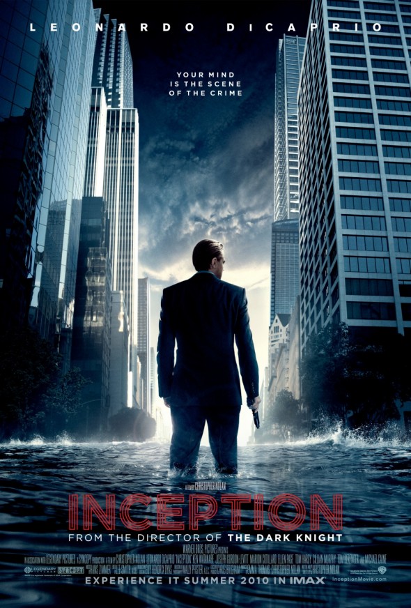 Inception is the new film by Christopher Nolan, scheduled for release in 2010, not a lot is known about the plot of the film, all that is known is that it is a mind influenced thriller starring Leonardo DiCaprio.
The First thing to draw your attention to the poster is the main image of what appears to be Leonardo DiCaprio standing knee high in water, holding a gun and surrounded by a city scape. These four things are clear indicators to what we can expect from the film, firstly the fact that in the middle of the screen is the lead actor shows that he is the main character and important to the film, the main character is also holding a gun which could link to violence in the film or maybe portray him as a policeman, being in the middle of a city could show where the film is situated being in the middle of a busy city allows people to relate to the film and with the inclusion of the apparent flood, this asks questions on how, why and when does this happen.
At the top of the poster is the name Leonardo DiCaprio, which is very bold and stands out from the background, which shows that this is one of the selling points of the film.
Just below this is the tag line "Your mind is the scene of the crime", this is an indicator to the influence of the mind in the film the fact that the word mind and crime are linked in the same sentence could link to a police thriller, or a science fiction film.
The title itself is pushed down to the bottom of the poster, perhaps showing its relevance to what the poster is trying to achieve, however its font and style are very different to the other writing on the poster, being written in red, may link it to violence. The word Inception itself means the beginning of something, which asks what relevance does this have to film and if it does what is it the beginning of.
On top of the title in very small writing is "A Film By Christopher Nolan" while under the title is "From the director of the Dark Knight", although both of these are the same person, it shows that Christopher Nolan is not a household name but the Dark knight is, this clearly shows the selling point of the film to be the involvement in the dark knight and not the man himself.
From this poster, we hope to gain the ability to ask several questions and show as many different film indicators to keep the audience intrigued and questioning what they are looking at.
Thursday, 25 March 2010
Evaluation of Trailer shots
Shot One
 The first shot you see in the trailer is this one of the main female character. We chose to give the identity of the main character straight away because we are creating mystery in other elements of the trailer involving her. We also wanted the trailer centred around her because we use techniques, involving her, that are likely to entice our audiences. We use dark lighting to create a relaxed but seductive atmosphere and we use this over the shoulder shot of her in the mirror because we believe its effective in showing her and her actions and makes it seem like the audience are looking secretly over the shoulder or 'through the keyhole'.
Shot 2

This shot is a close up of her putting on her lipstick, this is followed by an extreme close up of her lips (shot 3). We used these shots to make this female character seem sexy and entice the audience in to watching the rest of the trailer.
Shot 3

Shot 4

This title is the beginning of our narrative and where the audience begin to form their idea of a plot. We used a dark background to connote a mysterious atmosphere and with the white title it helps the title stand out. We kept the style and colours of the title simple so to not detract from the important message being shown.
Shot 5

This a medium shot we used when the phone begins to ring. We used this shot because it includes the phone and the character showing her reaction in it. We used dim lighting to carry on this mysterious yet seductive vibe.
Shot 6

This is an over-the-shoulder shot of the caller on the other end of the line. We have made the lighting even darker so you can only see the outline of the character. This is to create enigma and spark suspicion in the audience. We have the character holding what looks like a glass of whiskey to make him look powerful, he also uses a deep, intimidating voice, connoting that he is the boss.
Shot 7

This shot shows our female character playing with a gun that she had hidden in what looks like an old fashioned jewellery box. This begins to show what kind of character this female might be and also suggests a possible action genre of the film. The way she is playing with it also suggest she knows what she is doing and that she is preparing it for something, building tension in the trailer.
Shot 8

This is the last shot of this particular scene and it ends with the female lead holding the gun and looking in the mirror with an evil and suggestive expression. This tells the audience more about this character's identity and creates more suspense.
Shot 9

After the bedroom scene the camera cuts to a man running away from what looks like the same female character in the distance. We used a woodland setting to make the male victim seem more vulnerable, and this kind of setting is seen quite commonly in action or thriller films for these situations.
Shot 10
Next, we cut to a close up of the female's feet to show her progress. The fact she is simply walking after a man who is running away suggests she is powerful and her relaxed demeanor shows she must have some form of plan of catching this man.
Shot 11

We used this low angle shot of who audiences will begin to refer to as 'Lola', makes her look powerful and in complete control of the situation.
Shot 12

This shows the male victim jumping over a fence, we used this action to show his struggle to get away and the fact he doesn't walk round shows his hurry and panic and fear of the woman following him.
Shot 13

We then cut to this close up of the victim to show the fear and panic in his face and carry on building tension in the trailer.
Shot 14

This shot shows the victim running away from the camera, almost like the audience are now seeing the victim from 'Lola's' point of view. This may make the audience feel in control or they may sympathize the character, sparking feeling in the audience was one of our aims. In this shot you see the character fall over in the snow, we decided to use the snowy setting to our advantage by showing the victim's recurring struggle to get away from Lola. This helps us create the powerful yet creepy image of our female lead, Lola.
Shot 15

Next you see Lola walk around the fence that the victim leapt over in his struggle. The fact she walked round it with ease shows her relaxed demeanor. You then see her look down at her gun, smile, and shake her head, almost like she is making a mockery of this man.
Shot 16

This shot shows the male character slowing to a stop and looking around but not finding the female he is running from. This shot shows him starting t relax and catch his breath. But as the shot cuts to a close up (shot 17) of him looking up you see his calmer face turn to shock, it is clear the 'assassin' is back.
Shot 17

Shot 18

This scene then finished with Lola appearing with a gun pointed at her head, leaving the audience in suspense and leaving this particular storyline on a cliff hanger.
After all these shots we have three titles shown saying 'But Remember...', 'What goes around...', 'Comes back around.'. Between these titles we have low angle shot of Lola strutting towards the camera looking confident. Then after the title 'Comes back around.' You hear a car screech and in a shot from behind Lola you see her turn around in shock with a scared looking expression on her face, creating another cliffhanger and changing the views and judgements the audience may have created on her.
Subscribe to:
Comments (Atom)